




The first time someone experiences your event is when they lay eyes on your event page. And whether you're a marketer, event planner, or designer, having a great event page all comes down to great design.
In this new special creative edition of Run of Show, Pete from our Education team goes over seven design principles that will take your event pages to the next level — and get people excited from the moment they submit their RSVP.
Check it out:
Love the animation in this video? Check out Ink Factory.
Want to see more Run of Show videos? See our archives page here and subscribe to stay in the loop.
Hey guys, I'm Pete Richardson, part of the Education team here at Splash, and I'm taking over this week's Run of Show. As an educator at Splash I've seen a ton of event pages. Some are really well designed, some... not so much.
So for everybody in that second bucket, we've developed seven principles of design to help make your event pages stand out.
This is a common notion in web design, but for you non-designers out there, it's referring to the notion that all of your information should live inside the browser window without having to scroll. It's a great rule to follow, but too often I see event pages where one of two things happens:
1) Everything is crammed up top: You have your speakers, you have your registration form, you have your "About the event" section, maybe you're even trying to include a map — all in one screen.
2) The infinite scroll: As you keep scrolling down the page, you see a long event page with seemingly never-ending information like the schedule, speakers, location, etc.
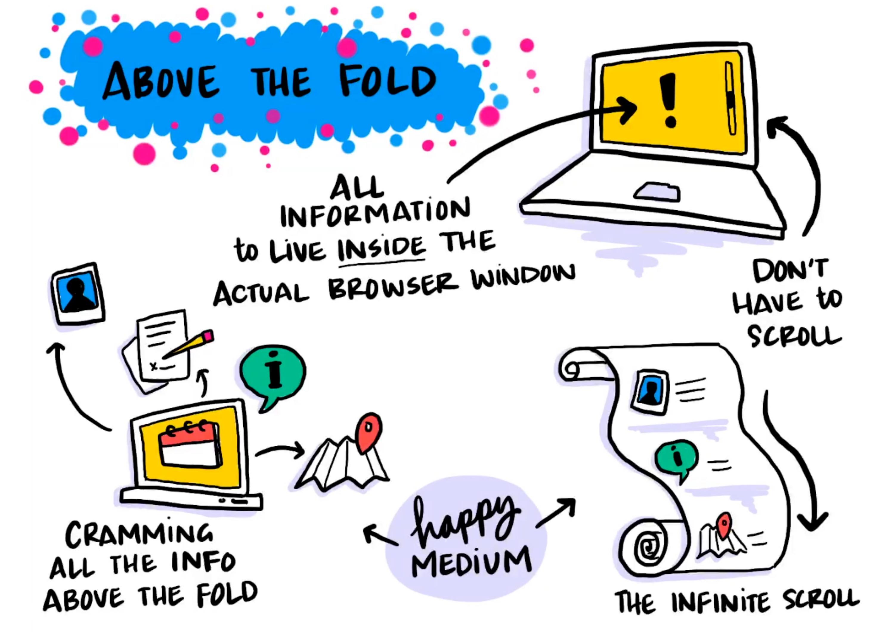
Design tip: Find a happy medium between the two by using design elements that urge your attendees to want to explore more about your event. Some of these effective design elements include:
The second design principle has to do with the delightful world of hover states.
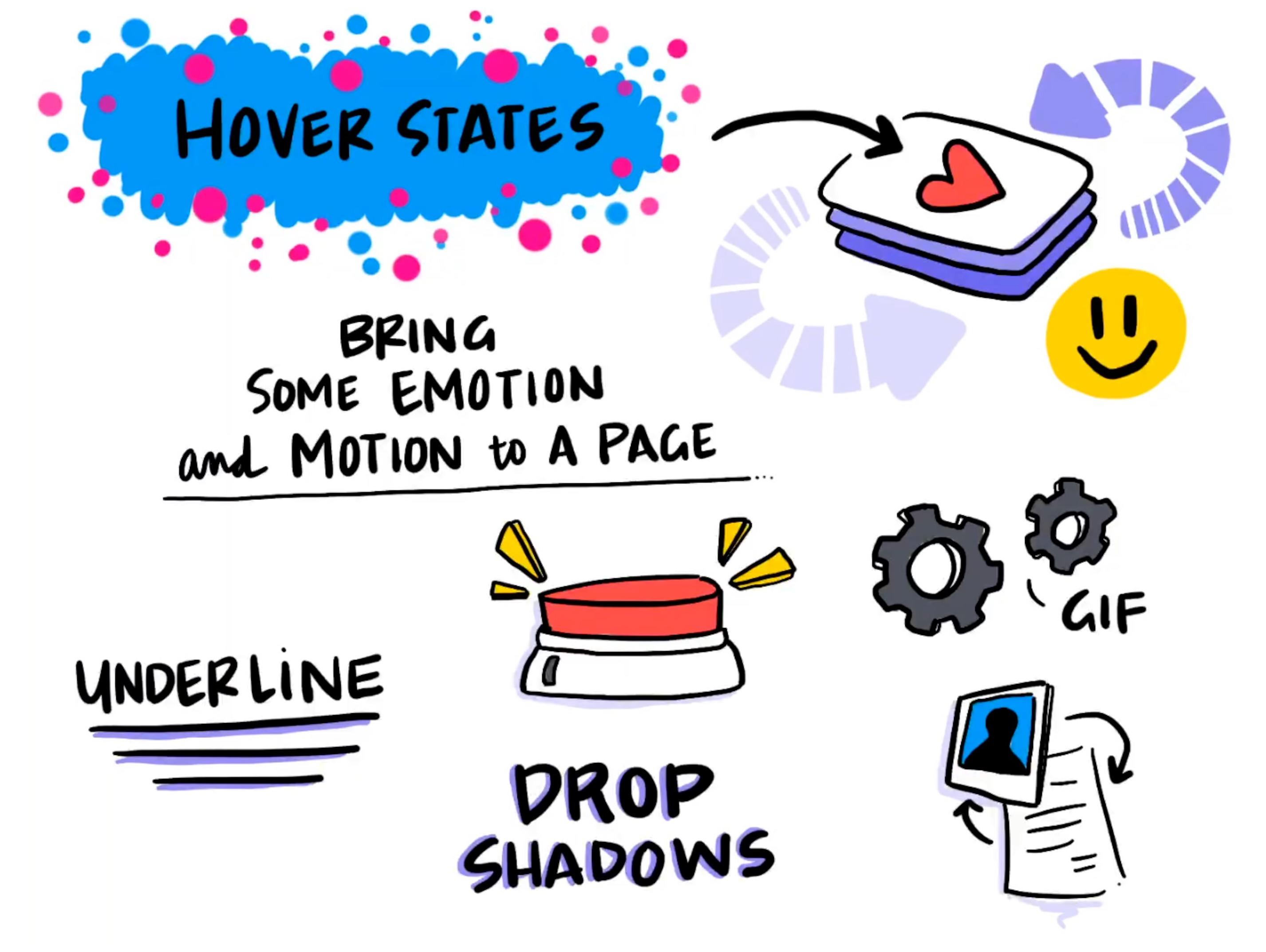
Design tip: Think of this as an opportunity to bring emotion and motion to your event page. Some ideas include:
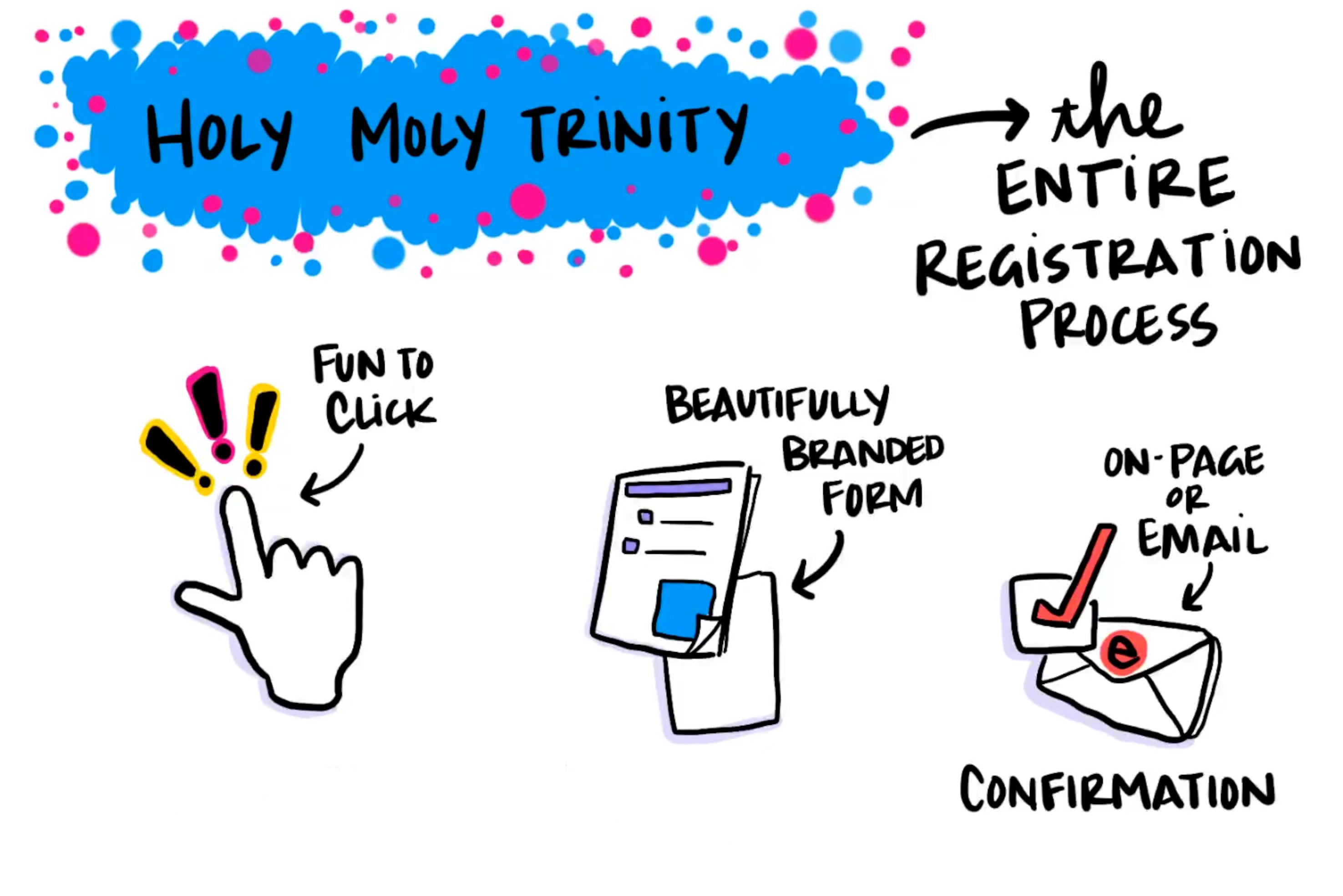
Number three is the Holy Moly Trinity. At Splash this is how we describe the entire registration process, and it's pretty simple.
Design tip: You want your guests' experience to feel cohesive, so focus on these key elements of the registration process:
We're living in a digital world, where the majority of people on the internet are on their mobile phones.
And whether someone is on the subway, on their way to work, or walking down the street, there's not a lot of time to register for an event — especially if they were texted an event, click on that event card and go right through to the registration process.
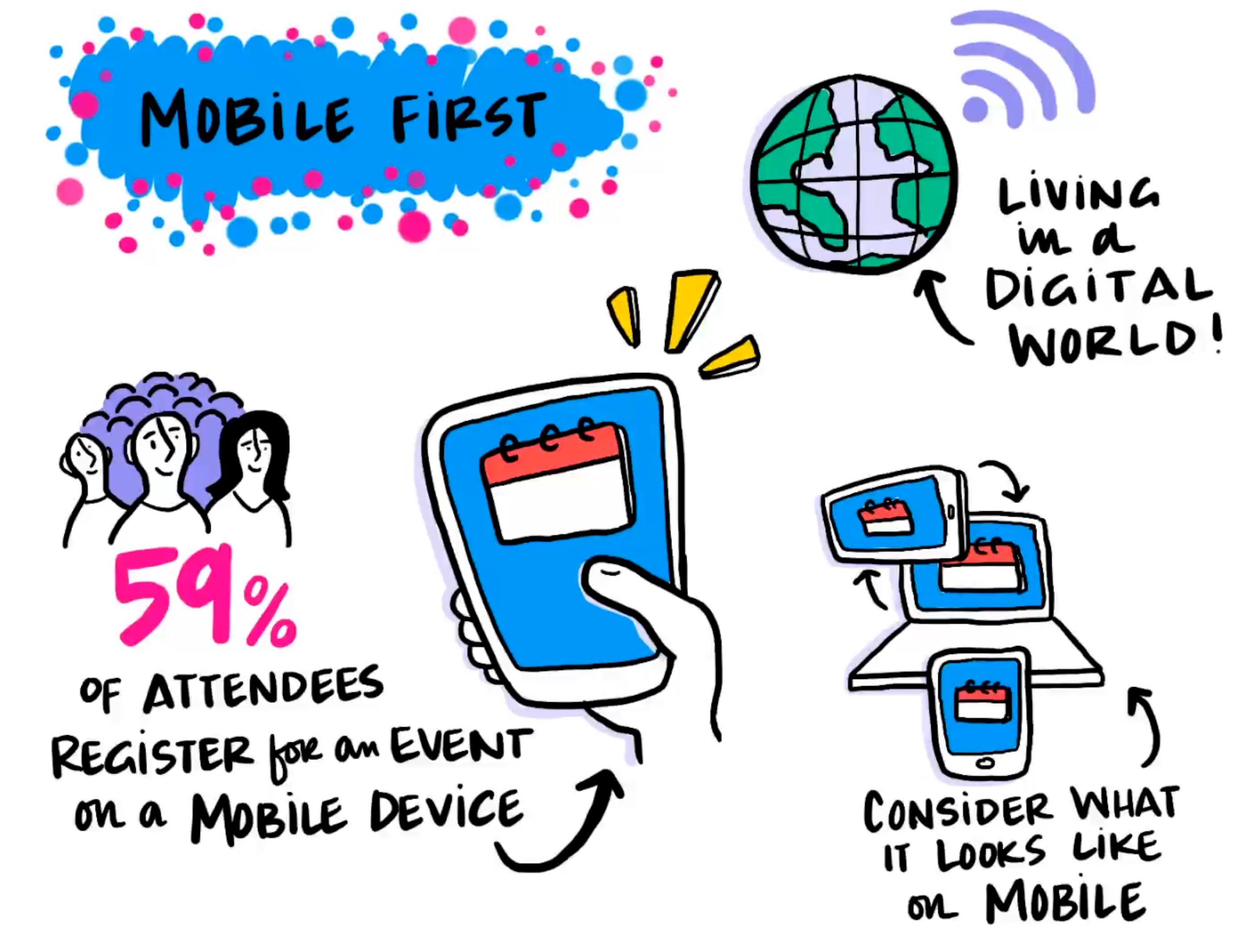
Design tip: 59% of attendees register for events on their mobile device. So if that's their only experience with your brand's event page, it better look as beautiful as it does on desktop and tablet. Here's what to remember:
Number five: imagery matters.
Even if you're not as blessed as a National Geographic or a Red Bull that already has beautiful imagery, don't fret because there's plenty of royalty-free stock photography websites out there that you can download from.
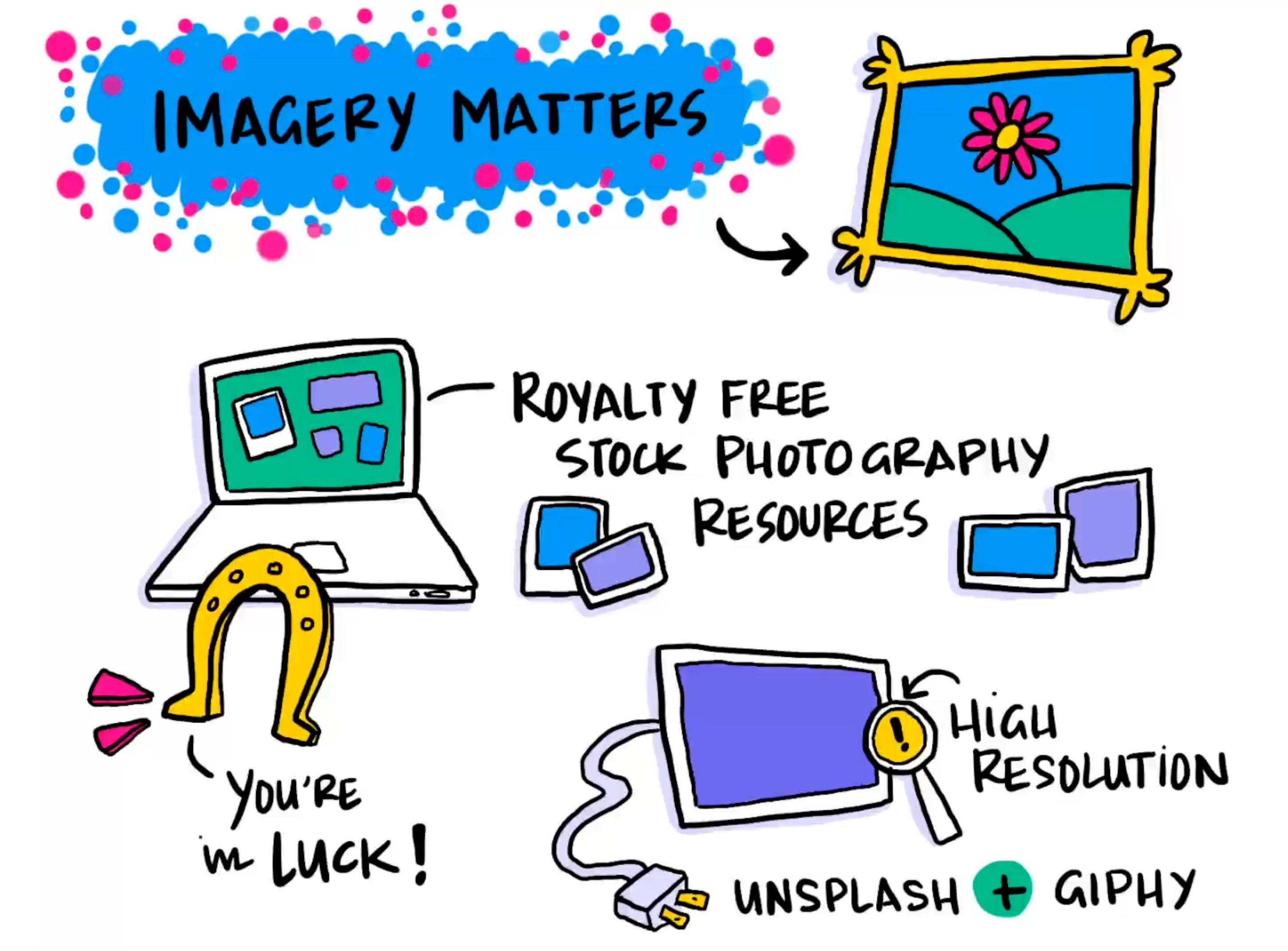
Design tip: There's never really a perfect-size image, but you always want to make sure your imagery is crystal clear. Because even if you're building your event page on a laptop screen or optimizing it for mobile, there may be some attendees who view it on a large monitor. Here's how:
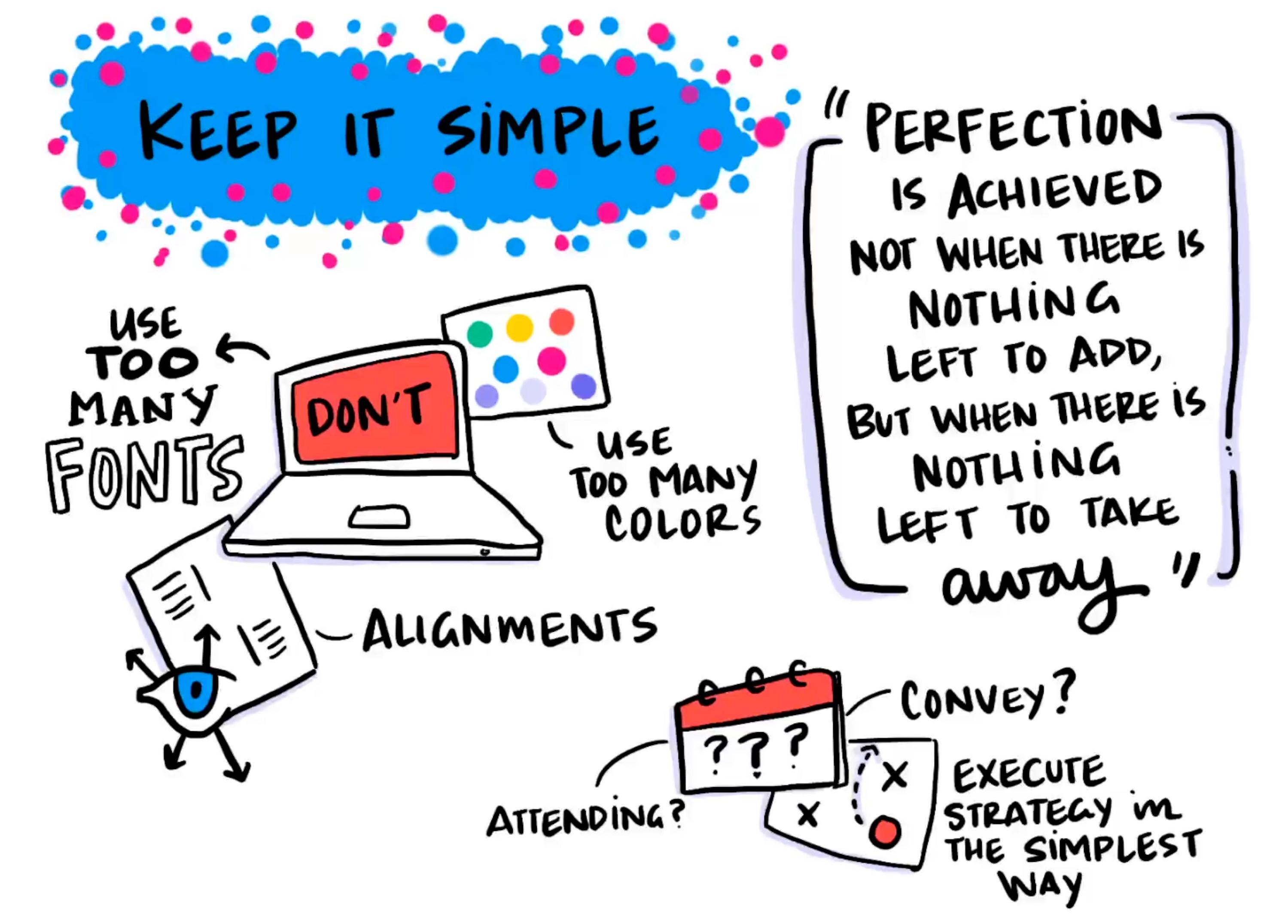
This principle reminds me of a great quote, and it goes, "Perfection is achieved not when there's nothing left to add, but when there's nothing left to take away."
Design tip: When you're designing your event page, think about the things you can take away until it becomes the perfect experience for somebody. Here's what I mean:
It's been overstated to know your audience. But I want you guys to take it a step further and speak to your audience.
Design tip: Engage with your audience through your messaging. Any type of human interaction that you can bring to your page will be completely refreshing for users. Here's some ideas
That's what's really gonna turn the switch for you guys. Give some thought to how you want to connect your brand's voice with your audience -- all through the event page's messaging.
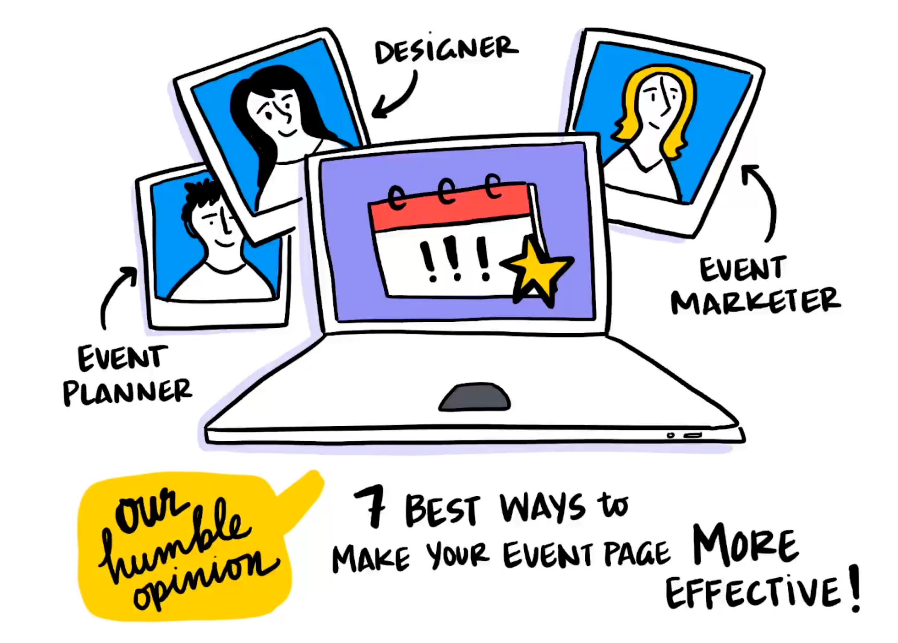
So there you have it, our seven design principles. These aren't formal rules by any means -- we're not gonna come to your door and kick it down just because you're not following these guidelines.
We just have, in our humble opinion, the seven best ways to make your event page more effective.
Want to see more Run of Show videos? Find all of the videos here and subscribe to stay in the loop!


